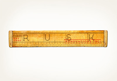
I fell especially hard for this logo for Rusk Renovations, Inc.; the vintage-feeling ruler and typography completely did me in.

I also am head over heels for what looks to have been an amazing issue of the Italian magazine, Un Sedicesimo. The issue was devoted to the Italian and French script typefaces from Louise Fili and Steven Heller's collections, and it looks like it would provide endless inspiration.


Finally, I adore this image from Louise Fili's sneak peek on Design*Sponge. The vintage tin is gorgeous, and I love that it is used to display some of the matchbooks and business cards from restaurants for which they have designed logos.

Stay tuned for more from this accomplished firm, as tomorrow I will be sharing some of my favorite packaging work from their portfolio.